![]() Call Linda Today! 425-785-3724
Call Linda Today! 425-785-3724
![]() Call Linda Today! 425-785-3724
Call Linda Today! 425-785-3724
Welcome Home Blog!
Welcome Home Blog!
Check back often for news and updates.
We strive to offer a complete and updated collection of real estate industry news, community updates, neighborhood information; as well as guides to suport both home buyers, and house sellers.
In a world that moves at breakneck speed, the importance of creating spaces that serve as personal sanctuaries becomes paramount. The home is not just a physical space but an emotional retreat where colors play a critical role in affecting our mood and well-being. As such, the annual announcement of the "Color of the Year" by influential paint companies isn't merely a trendsetting event—it's a barometer of the collective psyche, seeking to bring harmony into our lives through the thoughtful application of color to your home.
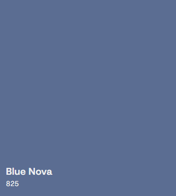
 Inspired by exploration, Benjamin Moore named Blue Nova (825) as its Color of the Year for 2024. The cosmic, blue-violet blend encourages adventure, beckoning everyone to indulge in new experiences.

Valspars 2024 selection, Renew Blue, epitomizes this trend. This green-tinged blue promises to transform any space into a tranquil haven, directly addressing the common yearning for an escape from the chaotic tapestry of daily life.

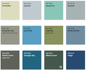
Sherwin Williams, on the other hand, took a different approach with their Anthology: Volume One. They chose four color groups: blues and greens, reds and purples, deeps and darks, and delicate tints. Each group offers a unique experience and can help soothe anxieties and provide a sense of sanctuary.

Meanwhile, Behr's Cracked Pepper offers understated elegance, proving that even the most subtle colors can have a profound impact on the ambiance of a home. Dutch Boy takes a holistic approach, with Ironside leading their color narrative—a deep green that embodies the reassuring essence of nature itself. Their palette categories, Embrace, Retreat, and Inspire, further illustrate the industry's commitment to fostering environments that cater to mental wellness and creative expression.
As we take a moment to appreciate these carefully selected colors, we're reminded of the power they have to shape our experiences. The thoughtfulness that goes into these selections demonstrates a deep understanding of the human condition and the role our surroundings play in our happiness and productivity. As we consider integrating these colors into our own lives, we can look forward to the ways in which they will influence our moods, our thoughts, and our moments of peace. The "Color of the Year" is more than a fleeting fashion—it's a conscious step towards crafting the quality of our daily lives, one brushstroke at a time.